Hollywood's Timeless Problem - Men Keep Getting Older, Women Stay the Same Age
By Andrew Robson
March 19, 2023
This week’s TidyTuesday dataset (pretend I’m not months late to the party) is about age gaps in films. We’ll be exploring the trends in age gaps over time, the percentage of films with older male vs. older female actors, and the top actors and directors with the largest age gaps in their films.
We’ll also be using Patchwork, a powerful package for creating complex layouts with multiple plots. I really wish this existed earlier in my career - it’s so easy.

In the first step of our analysis, we add a new variable to our dataset called age_gap_direction. This variable indicates whether the older partner in the relationship is a man or a woman. We do this by comparing the genders of the two characters involved in the relationship. It’s important to note that, for simplicity, this is sadly a very heteronormative analysis, as it assumes that all relationships involve a man and a woman which is absolutely not true.
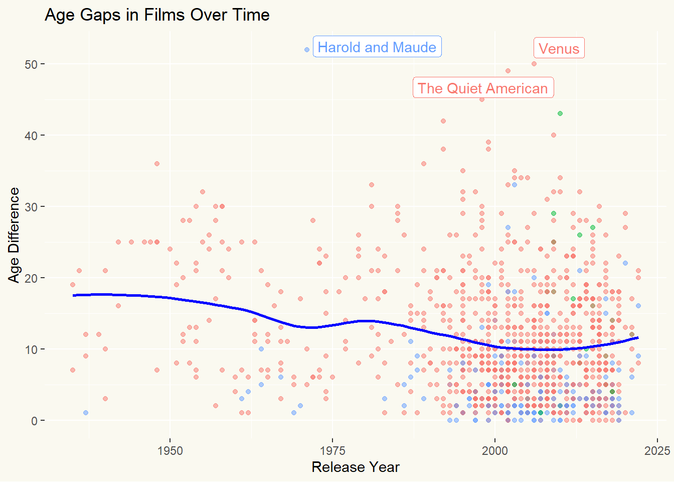
We also identify outliers in our dataset where the age gap is greater than 45 years. We use these outliers to add labels to our scatter plot later on.
tuesdata <- tidytuesdayR::tt_load(2023, week = 7)
##
## 	Downloading file 1 of 1: `age_gaps.csv`
age_gaps <- tuesdata$age_gaps

age_gaps <- age_gaps %>%
  mutate(age_gap_direction = case_when(
    character_1_gender == "man" & character_2_gender == "woman" ~ "Man older",
    character_1_gender == "woman" & character_2_gender == "man" ~ "Woman older",
    TRUE ~ "Other"
  ))


avg_age_diff <- age_gaps %>%
  group_by(release_year) %>%
  summarise(avg_age_difference = mean(age_difference, na.rm = TRUE))

outliers <- age_gaps %>%
  filter(age_difference > 45)
Now that we have this information in our dataset, we can use ggplot to plot the age gaps over time while highlighting the direction of the age gap. The chart shows a red hue for male-dominated age gaps. We can also see that, in general, the age gap is decreasing over time.
library(ggrepel)

# Create a scatter plot with the trend line
p3 <-ggplot(age_gaps, aes(x = release_year, y = age_difference, color = age_gap_direction)) +
  geom_point(alpha = 0.5) +
  geom_smooth(data = avg_age_diff, aes(x = release_year, y = avg_age_difference), color = "blue", linewidth = 1, se = F) +
  geom_label_repel(data = outliers, aes(label = movie_name)) +
  theme_minimal_blog +
  theme(legend.position = 'none') +
  labs(title = "Age Gaps in Films Over Time",
       x = "Release Year",
       y = "Age Difference")

p3
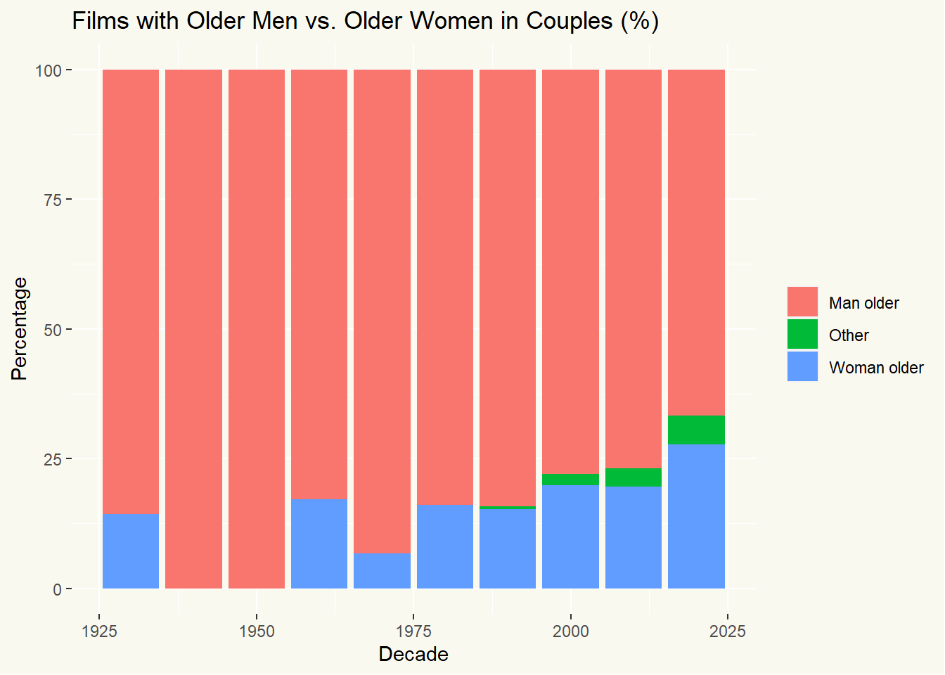
I wonder if there are more films with a female led age gap coming out more recently? Let’s look at that by calculating the raw counts and percentages of films coming out with female led age gaps.
age_gaps <- age_gaps %>%
  mutate(decade = 10 * (release_year %/% 10))

# Calculate the number of films in each category per decade
age_gaps_decade <- age_gaps %>%
  group_by(decade, age_gap_direction) %>%
  summarise(count = n()) %>%
  ungroup()

# Calculate the total number of films per decade
total_films_decade <- age_gaps_decade %>%
  group_by(decade) %>%
  summarise(total_films = sum(count)) %>%
  ungroup()

# Calculate the percentage of films in each category per decade
age_gaps_decade_pct <- age_gaps_decade %>%
  left_join(total_films_decade, by = "decade") %>%
  mutate(percentage = (count / total_films) * 100)

# Create a bar chart to visualize the results
p1 <- ggplot(age_gaps_decade_pct, aes(x = decade, y = percentage, fill = age_gap_direction)) +
  geom_bar(stat = "identity") +
  labs(title = "Films with Older Men vs. Older Women in Couples (%)",
       x = "Decade",
       y = "Percentage") +
  theme_minimal_blog +
  theme(legend.title = element_blank())

p1
What if we just look at raw counts?
p2 <- ggplot(age_gaps_decade_pct, aes(x = decade, y = count, fill = age_gap_direction)) +
  geom_bar(stat = "identity") +
  labs(title = "Films with Older Men vs. Older Women in Couples",
       x = "Decade",
       y = "Film Count") +
  theme_minimal_blog +
  theme(legend.title = element_blank())


p2
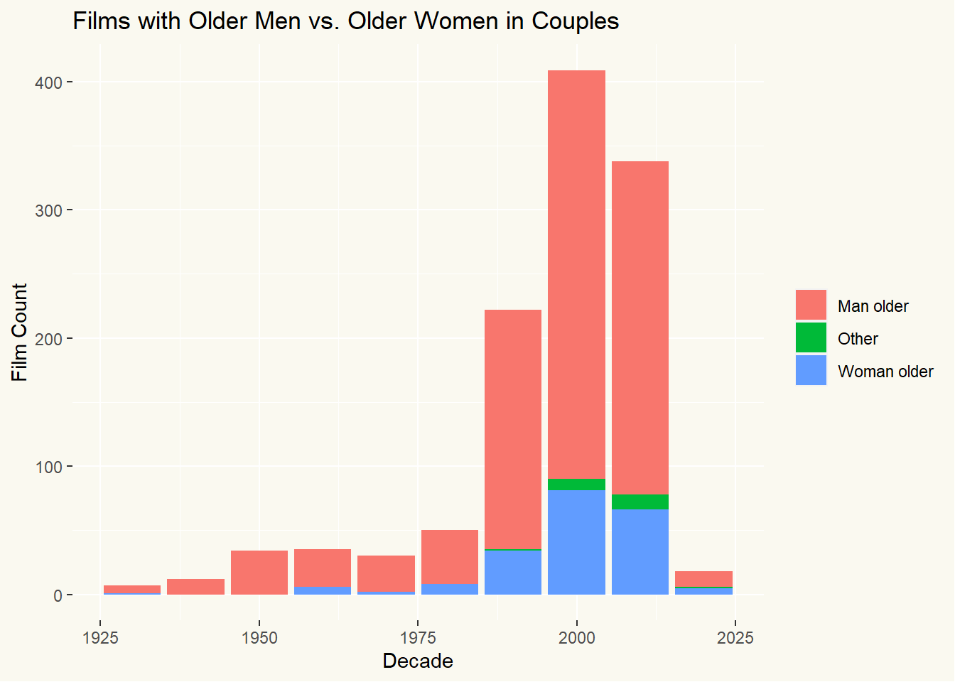
Interesting - in general, there are more films coming out recently which include a woman older gender split. However, it is still far from the norm, with the best decade still being 75% to 25% in favour of the man being older.
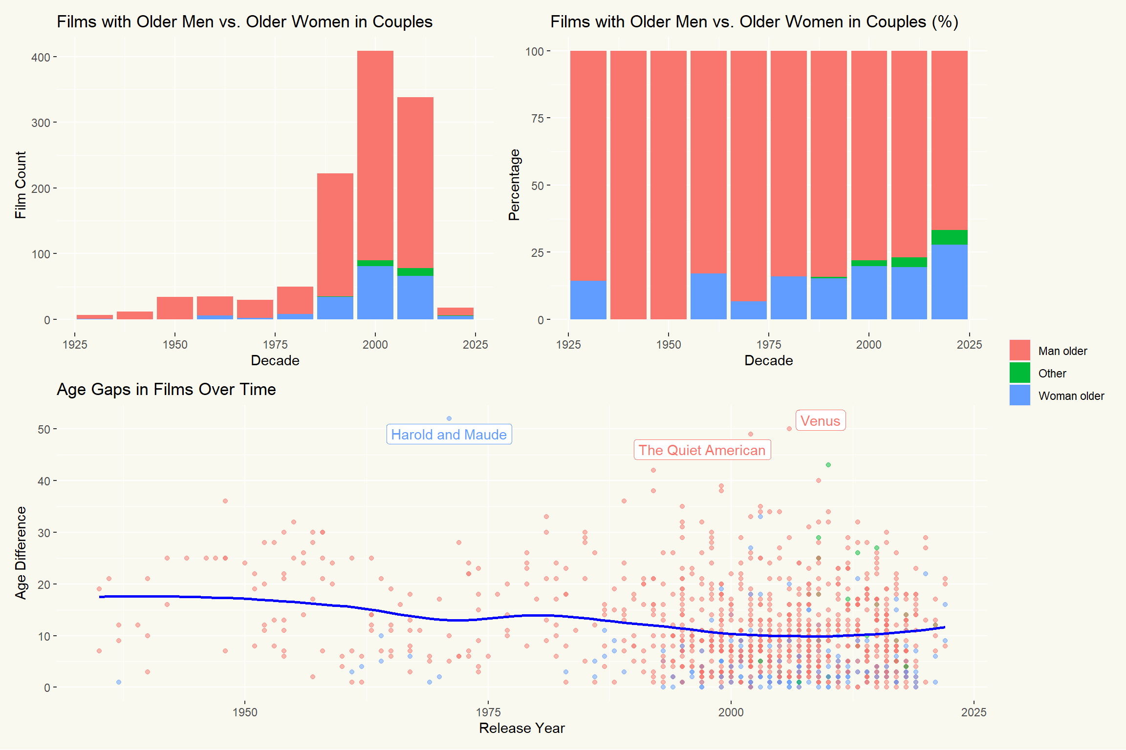
Now to use patchwork - which is very cool. In the past it was really a faff to combine charts but look how simple patchwork makes. it.
library(patchwork)
(p2 + p1) / p3  + plot_layout(guides = "collect") &
  plot_annotation(theme = theme(plot.background = element_rect(fill='#FAF9F0', color=NA)))
Let’s finish up by taking a deeper dive on specific actors and directors. First, let’s look at actors with the highest average age gap in their films. Again, using patchwork at the end to join the charts.
# Calculate average age gap and number of films for each actor
actor_age_gaps <- age_gaps %>%
  gather(actor, name, actor_1_name, actor_2_name) %>%
  group_by(name) %>%
  summarise(avg_age_gap = mean(age_difference, na.rm = TRUE),
            num_films = n()) %>%
  filter(num_films >= 5) %>%
  arrange(desc(avg_age_gap)) %>%
  slice_head(n = 10)  # Select the top 10 actors

# Order actors by their average age gap
actor_age_gaps <- actor_age_gaps %>%
  arrange(avg_age_gap)

# Identify the actor with the largest average age gap
largest_gap_actor <- actor_age_gaps$name[nrow(actor_age_gaps)]

# Create a lollipop chart with the largest age gap actor highlighted
p_actors_lollipop <- ggplot(actor_age_gaps, aes(x = reorder(name, avg_age_gap), y = avg_age_gap)) +
  geom_point(size = 4, aes(color = name == largest_gap_actor)) +
  geom_segment(aes(y = 0, yend = avg_age_gap, x = name, xend = name, color = name == largest_gap_actor), linewidth = 2) +
  coord_flip() +
  theme_minimal() +
  labs(x = "Actor",
       y = "Average Age Gap") +
  theme(legend.position = "none")


woody_allen_films <- age_gaps %>%
  filter(actor_1_name == "Woody Allen" | actor_2_name == "Woody Allen") %>%
  arrange(release_year)

p_woody_allen <- ggplot(woody_allen_films, aes(y = reorder(paste(movie_name, release_year), release_year), x = age_difference, fill = movie_name)) +
  geom_bar(stat = "identity", alpha = 0.8) +
  geom_text(aes(label = paste(movie_name, release_year, sep = ' - ')), x = 1, hjust = -0.01, size = 5, angle = 90) +
  theme_minimal() +
  theme(axis.text.x = element_blank(),
        legend.position = 'none') +
  labs(y = "Film (Release Year)",
       x = "Age Difference") +
  coord_flip()


p_actors_lollipop + p_woody_allen &
  plot_annotation(theme = theme(plot.background = element_rect(fill='#FAF9F0', color=NA)))
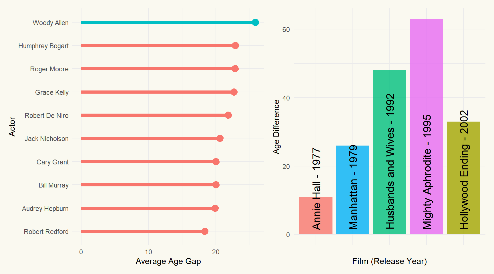
Perhaps not surprisingly, Woody Allen is at the top. I hadn’t heard of Mighty Aphrodite but ChatGPT tells me the following:
“In Mighty Aphrodite, the age gap is quite large because Mira Sorvino’s character was portrayed as a young and naive prostitute, while Woody Allen’s character was an older and married man who adopts her. This kind of storyline is unfortunately quite common in movies, perpetuating harmful stereotypes and problematic power dynamics.”
Classic Woody Allen yikes.
Let’s do the same for directors.
# Order directors by their average age gap
director_age_gaps <- age_gaps %>%
  group_by(director) %>%
  summarise(avg_age_gap = mean(age_difference, na.rm = TRUE),
            num_films = n()) %>%
  filter(num_films >= 5) %>%
  arrange(desc(avg_age_gap)) %>%
  slice_head(n = 10)  # Select the top 10 directors

# Identify the director with the largest average age gap
largest_gap_director <- director_age_gaps$director[1]

# Create a lollipop chart with the largest age gap director highlighted
p_directors_lollipop <- ggplot(director_age_gaps, aes(x = reorder(director, avg_age_gap), y = avg_age_gap)) +
  geom_point(size = 5, aes(color = director == largest_gap_director)) +
  geom_segment(aes(y = 0, yend = avg_age_gap, x = director, xend = director, color = director == largest_gap_director), linewidth = 2) +
  coord_flip() +
  theme_minimal() +
  labs(x = "Director",
       y = "Average Age Gap") +
  theme(legend.position = "none")


# Filter the data for Alfred Hitchcock's films and arrange by release year
hitchcock_films <- age_gaps %>%
  filter(director == "Alfred Hitchcock") %>%
  arrange(release_year)

p_hitchcock <- ggplot(hitchcock_films, aes(y = reorder(paste(movie_name, release_year), release_year), x = age_difference, fill = movie_name)) +
  geom_bar(stat = "identity", alpha = 0.8) +
  geom_text(aes(label = paste(movie_name, release_year, sep = ' - ')), x = 1, hjust = -0.01, size = 5, angle = 90) +
  theme_minimal() +
  theme(axis.text.x = element_blank(),
        legend.position = 'none') +
  labs(y = "Film (Release Year)",
       x = "Age Difference") +
  coord_flip()


p_directors_lollipop + p_hitchcock &
  plot_annotation(theme = theme(plot.background = element_rect(fill='#FAF9F0', color=NA)))
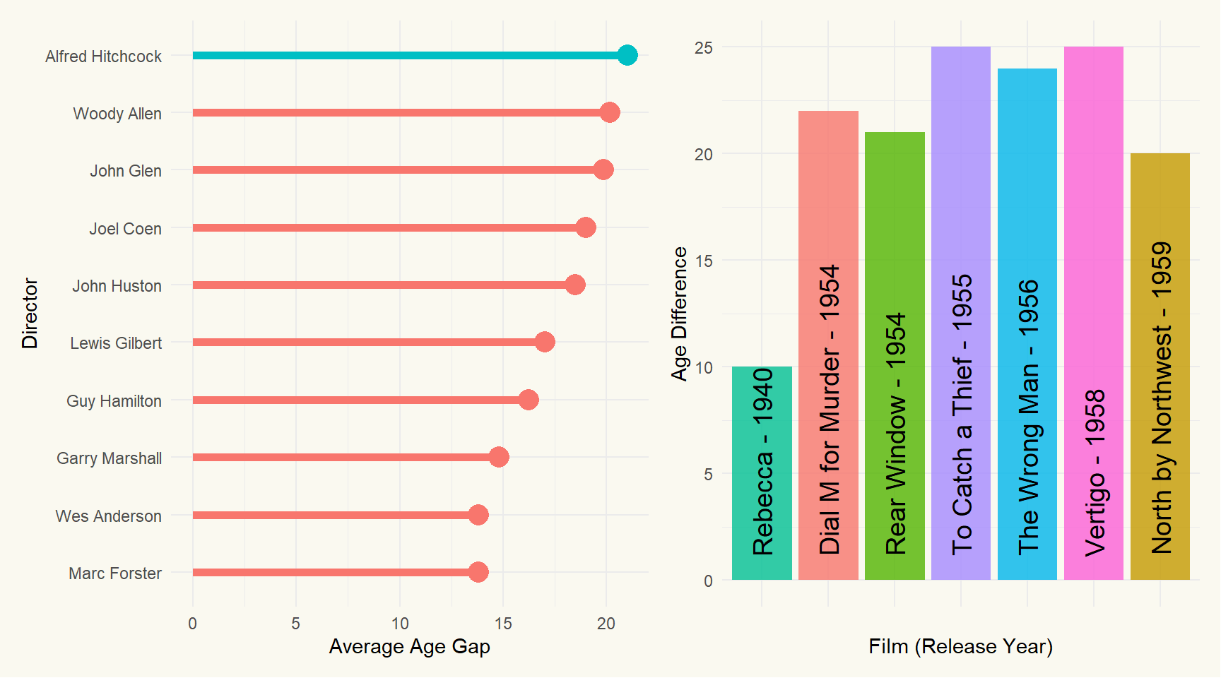
There’s Woody Allen again but this time he’s been out-yikesed by Alfred Hitchcock. ChatGPT gives us the following insight:
“It is interesting to note that Alfred Hitchcock’s films tend to have a high age gap between the male and female leads, with an average age gap of 21.5 years. This may be due to the fact that Hitchcock often cast older male leads, such as Cary Grant and James Stewart, opposite much younger female co-stars. It’s also possible that this reflects the societal norms and gender roles of the time, as Hitchcock’s films were made primarily in the mid-20th century.”
- Posted on:
- March 19, 2023
- Length:
- 7 minute read, 1357 words
- See Also: